Themes Folder
This folder has a set of themes encapsulated by ResourceDictionary and implements “Color” tagging, a group of colors that will qualify Xamarin.Forms interfaces.
Table of contents
SOLUTION
- The
Themes of MonettelliUIKIThave been carefully done, taking into accountthe contrast of the background and the text, creating a visible effect for the eyes.
NOTE
- The colors of the themes are classified as follows:
Range Colors:They are the main colors, the range is determined by the level of prominence.Background Colors:These colors are considered in the first layer of an interface.Entry Colors:Typical colors for input control.Border Colors:Border colors for controls such as buttons, frames, etc.Remark Colors:Colors for the button type label control.Surface Colors:These colors are considered in the second layer of an interface.Shell Colors:Colors for Tabs and Flyout.
Components of the themes Table
| Region | Name(s) | x:Key(s) |
|---|---|---|
| Range Colors | Primary, Secondary, Tertiary, Quaternary, Quinary… | colPrim, colSec, colTer, colQua, colQui… |
| Background Colors | Color Start[Background Color Count], Color End[Background Color Count] | colStartBG1, colEndBG1, colStartBG2, colEndBG2… |
| Entry Colors | under construction… | under construction… |
| Border Colors | under construction… | under construction… |
| Remark Colors | under construction… | under construction… |
| Surface Colors | Start Surface Color[Count], End Surface Color[Count] | colStartSurf1, colEndSurf1, colStartSurf2, colEndSurf2… |
| Shell Colors | Color[Property Shell] | colTabBarUns, colTabBarBack, colTabBarTitle… |
Structure of the themes Code Example
<?xml version="1.0" encoding="utf-8" ?>
<ResourceDictionary
    x:Class="XF_MonettelliUIKIT.Themes.LightTheme"
    xmlns="http://xamarin.com/schemas/2014/forms"
    xmlns:x="http://schemas.microsoft.com/winfx/2009/xaml"
    xmlns:d="http://xamarin.com/schemas/2014/forms/design"
    xmlns:mc="http://schemas.openxmlformats.org/markup-compatibility/2006"
    Source="/Styles/General.xaml"
    mc:Ignorable="d">

    <!--#region Color Range-->
    <Color x:Key="colPrim">#6200EE</Color>
    <Color x:Key="colSec">#000000</Color>
    <Color x:Key="colTer">#4E4E4A</Color>
    <Color x:Key="colQua">#4E4E4A</Color>
    <Color x:Key="colQui">#FF000000</Color>
    <!--#endregion-->

    <!--#region Backgroundcolors-->
    <Color x:Key="colStartBG1">#F2F2F2</Color>
    <Color x:Key="colEndBG1">#F2F2F2</Color>
    <Color x:Key="colStartBG2">#FEFEFE</Color>
    <Color x:Key="colEndBG2">#FEFEFE</Color>
    <!--#endregion-->

    <!--#region Entry Colors-->
    <Color x:Key="colAccCheck">#FFE7F9F5</Color>
    <Color x:Key="colAccError">#FFF9E7EB</Color>
    <Color x:Key="colAccUns">#FFF2F3F5</Color>
    <Color x:Key="colUnsPrim">#FFC7CAD1</Color>
    <Color x:Key="colAltQua">#FFE3E7EF</Color>
    <!--#endregion-->

    <!--#region Border Colors-->
    <Color x:Key="colBorCheck">#FF10CA87</Color>
    <Color x:Key="colBorError">#FFCA1030</Color>
    <!--#endregion-->

    <!--#region Remark Colors-->
    <Color x:Key="colRemPrim">#FFF93963</Color>
    <Color x:Key="colRemSec">#FFD4145C</Color>
    <!--#endregion-->

    <!--#region Surface Colors-->
    <Color x:Key="colStartSurf1">#FFFFFF</Color>
    <Color x:Key="colEndSurf1">#FFFFFF</Color>
    <Color x:Key="colStartSurf2">#F3F4F9</Color>
    <Color x:Key="colEndSurf2">#F3F4F9</Color>
    <Color x:Key="colStartSurf3">#FFFFFF</Color>
    <Color x:Key="colEndSurf3">#FFFFFF</Color>
    <!--#endregion-->

    <!--#region Shell Colors-->
    <Color x:Key="colTabBarUns">#4E4E4A</Color>
    <Color x:Key="colTabBarBack">#FFFFFF</Color>
    <Color x:Key="colTabBarTitle">#6200EE</Color>
    <Color x:Key="colBackgroundColor">#FFFFFF</Color>
    <Color x:Key="colForegroundColor">#6200EE</Color>
    <Color x:Key="colTitleColor">#6200EE</Color>
    <!--#endregion-->

</ResourceDictionary>
Light-xaml
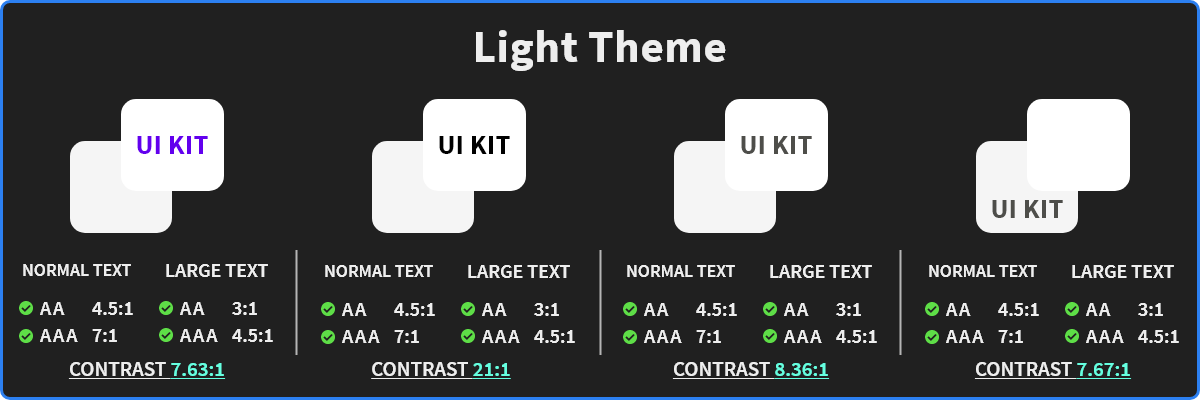
The light theme is the most common and familiar in an application, it has a powerful psychological boost, invokes thoughts of cleanliness, modernity and efficiency.
SOLUTION
- The
Light Themehaving a light background is used when readability is heavy or more as it highlights the main elements of the application.
Dark-xaml
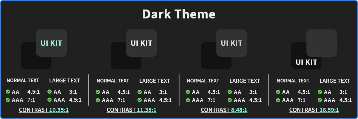
A dark theme displays dark surfaces across the majority of a UI. It’s designed to be a supplemental mode to a default (or light) theme.
Dark themes reduce the luminance emitted by device screens, while still meeting minimum color contrast ratios. They help improve visual ergonomics by reducing eye strain, adjusting brightness to current lighting conditions, and facilitating screen use in dark environments – all while conserving battery power. Devices with OLED screens benefit from the ability to turn off black pixels at any time of day.
SOLUTION
- With the
Dark Themeyou will have a distraction free design and keep users’ attention on a particular item.
InstagramDark-xaml
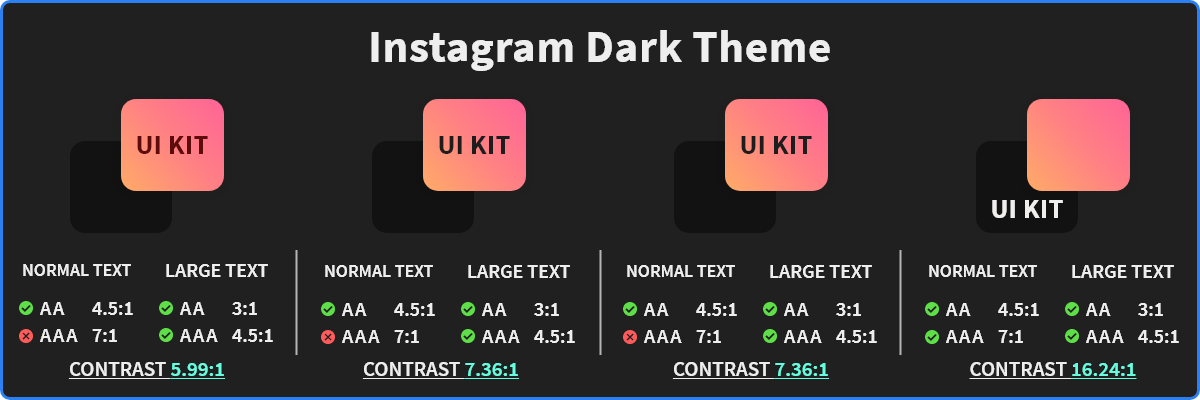
The instagramDark theme is an extension of the dark theme with some typical Instagram color mods.
SOLUTION
- MonettelliUIKIT uses gradients in the
InstagramDark Theme, which gives it a bright look in important areas of a design without overlooking the contrast.
InstagramElegant-xaml
The elegant Instagram theme combines warm and strong colors that give an elegant contrast in the interfaces.
SOLUTION
- The use of gradients in the background highlights this
InstagramElegant Theme, MonettelliUIKIT focuses on the contrast of colors with the text, it is a priority that is willing to improve it even more.
